Matilde Ferreira

Mint Insight

February 2021 – June 2021

During my curricular internship, I worked within Mint Insight, a start‑up company created in the Project Management Laboratory course at the Faculty of Engineering, University of Porto. As the company’s Head Designer, my role mainly involved developing the corporate identity.

  • Branding

Curricular Internship

Communication Design Bachelor Degree, Faculty of Fine Arts University of Porto

Design Tools

  • Adobe Illustrator |
  • Adobe Photoshop |
  • Blender
Logotype for 'Mint Insight' set against a green background of mint leaves. The logo is composed of a stylized geometric leaf design integrated with the company name, which is prominently displayed in bold white letters. Below the name is the tagline 'Paving the future' also in white text.

Logo Concept

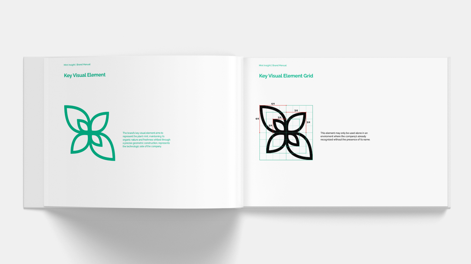
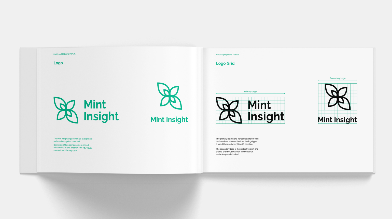
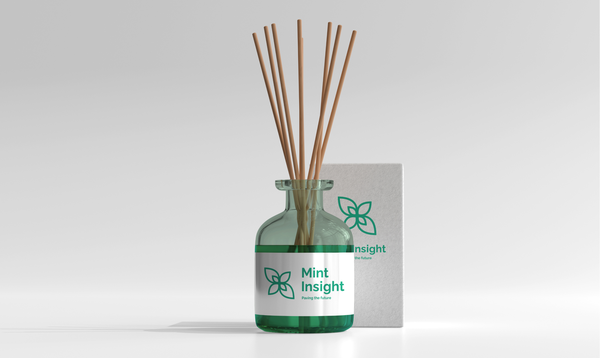
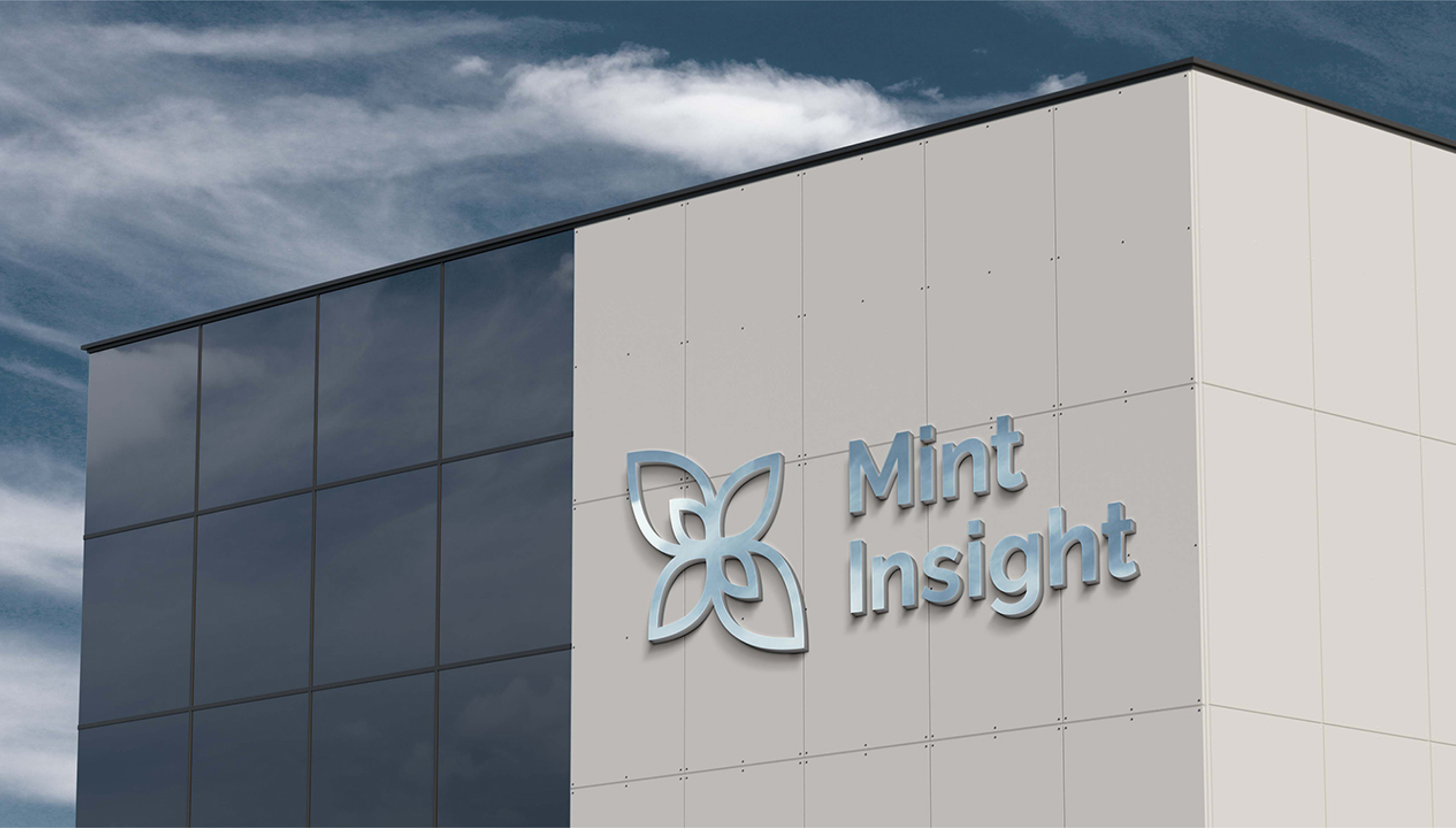
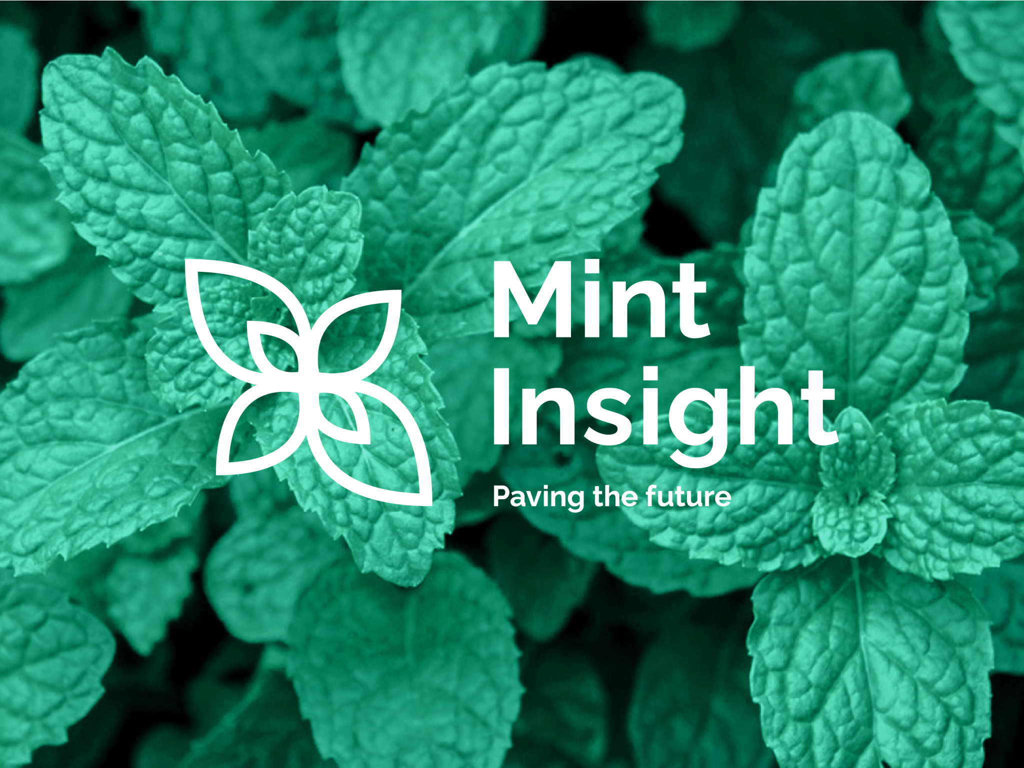
Mint represents in the brand name what Mint Insight aims to be: innovative and fresh. Therefore, this plant was immediately an important element in the construction of the company's identity.

The brand image of Mint Insight centers around an iconic representation of the mint plant, capturing the distinct form of its leaves. The final design aimed to balance the organic shapes with geometric precision, in order to reflect both the plant's natural essence and the technical core of the company.

A visual representation of the Mint Insight logotype construction grid, demonstrating the proportions and alignment of the logotype elements.

Color Palette

The primary color of Mint Insight derives from the vibrant green of the mint leaves, reinforcing the importance of this plant in the company's identity. It was important to select a shade that maintained legibility against both white and black backgrounds, enabling the brand image to seamlessly integrate various chromatic environments.

A square color swatch showcasing the color #00B992 A square color swatch showcasing the color #FFFFFF A square color swatch showcasing the color #00000

Typography

Mint Insight communicates through the sans‑serif font family Raleway. This elegant typography features a rounded design, ensuring a harmonious integration with the brand’s icon.

A preview of the Raleway font family, showing different weights.

Brand Manual

Cover of the 'Mint Insight' Brand Manual with the company's logo and the title 'Brand Manual' printed as white over green. A spread from the Mint Insight brand manual, featuring the key visual element, a stylized leaf motif, and its construction grid. A spread from the Mint Insight brand manual, featuring the primary and secundary logo, along with their respective grids. A spread from the Mint Insight brand manual, featuring a large color swatch of the primary brand color, Pantone 18-5728 TPX Mint Leaf, along with its Pantone and CMYK color codes.

The Fifth Element

In an attempt to explore the company's identity beyond its logo, the mint plant emerged as the fifth element of Mint Insight through its various sensory dimensions.

Vision

The presence of the mint plant during the presentation of the company at the LGP Challenge was essential. The plant had to be seen not only by its leaves, but as a whole.

Considering that this event would take place online, the physical presence of the mint plant would not be possible, thus it needed to be present in a digital form.

The plant was made tangible to the audience through an animated 3D render. In the produced animations the four projects proposed to Mint Insight, are symbolized through seeds. These are planted allowing a mint plant to sprout. Therefore, the development of the projects is associated with the plant's natural growth.

Flavor

Mint Insight's connection to the mint plant is not just aesthetic and visual, therefore its identity needs to address other senses as well. When you think of mint, its fresh flavor is directly invoked through synesthesia.

It was this sense that initially originated the name of the company. Thus, it must integrate its identity in a tangible way. The mint flavor could be present in sweets at the reception of the company’s building, or even in an ice cream served at its events.

A person's hand holding a white ice cream cup with a green spoon. The cup contains three scoops of mint green ice cream and features the Mint Insight logo.

Scent

The freshness of mint comes not only from its flavor, but also from its scent and, therefore, this sense must be explored in Mint Insight's identity. The smell of mint could be diffused in the auditorium of the LGP Challenge, embedding itself in the audience's memory, or even become the aroma of the company building.

A clear glass diffuser bottle with a green label featuring the Mint Insight logo and the phrase 'Paving the future'. The bottle is filled with reed sticks and is placed next to a white box with the Mint Insight logo

Identity Applications

A silver-colored Mint Insight logo mounted on the side of a modern building with a gray facade and a blue sky in the background. A black self-inking stamp with the Mint Insight logo and contact information on a white piece of paper. The paper is resting on a green surface A mint green hoodie with the Mint Insight logo on the front and back. The front logo is smaller and centered on the chest, while the back logo is larger and includes the tagline 'Paving the future'. A mint green and white USB drive with the Mint Insight logo on the side. The drive is resting on a green background. A mint green spiral-bound notebook with the Mint Insight logo and the tagline 'Paving the future' printed on the cover. A mint green lanyard with a silver clasp and a metal clip. The lanyard has the Mint Insight logo and the tagline 'Paving the future' printed on it. A teal t-shirt with the Mint Insight logo on the front and the text 'CEO Maria Junqueira' on the back.