Matilde Ferreira

Traqueno

February 2023 – July 2023

Traqueno was a start‑up company created in the Project Management Laboratory course at the Faculty of Engineering, University of Porto. The company's mission was to be the bridge that connected customers and service providers through its application. As the company’s Head Designer I was responsible for creating its corporate visual identity.

  • Branding

Academic Project

Multimedia Master Degree, Faculty of Engineering University of Porto

Design Tools

  • Adobe Illustrator
The Traqueno logotype over a gray background. It features the company's brandmark: two red stylized human figures with diamond-shaped heads and open-ended bodies, connected together at the hands and positioned at a 45-degree angle. The word 'Traqueno' is displayed in black text alongside the brandmark, with the tagline 'Booking made simple' in smaller scale and in red below.

Logo Concept

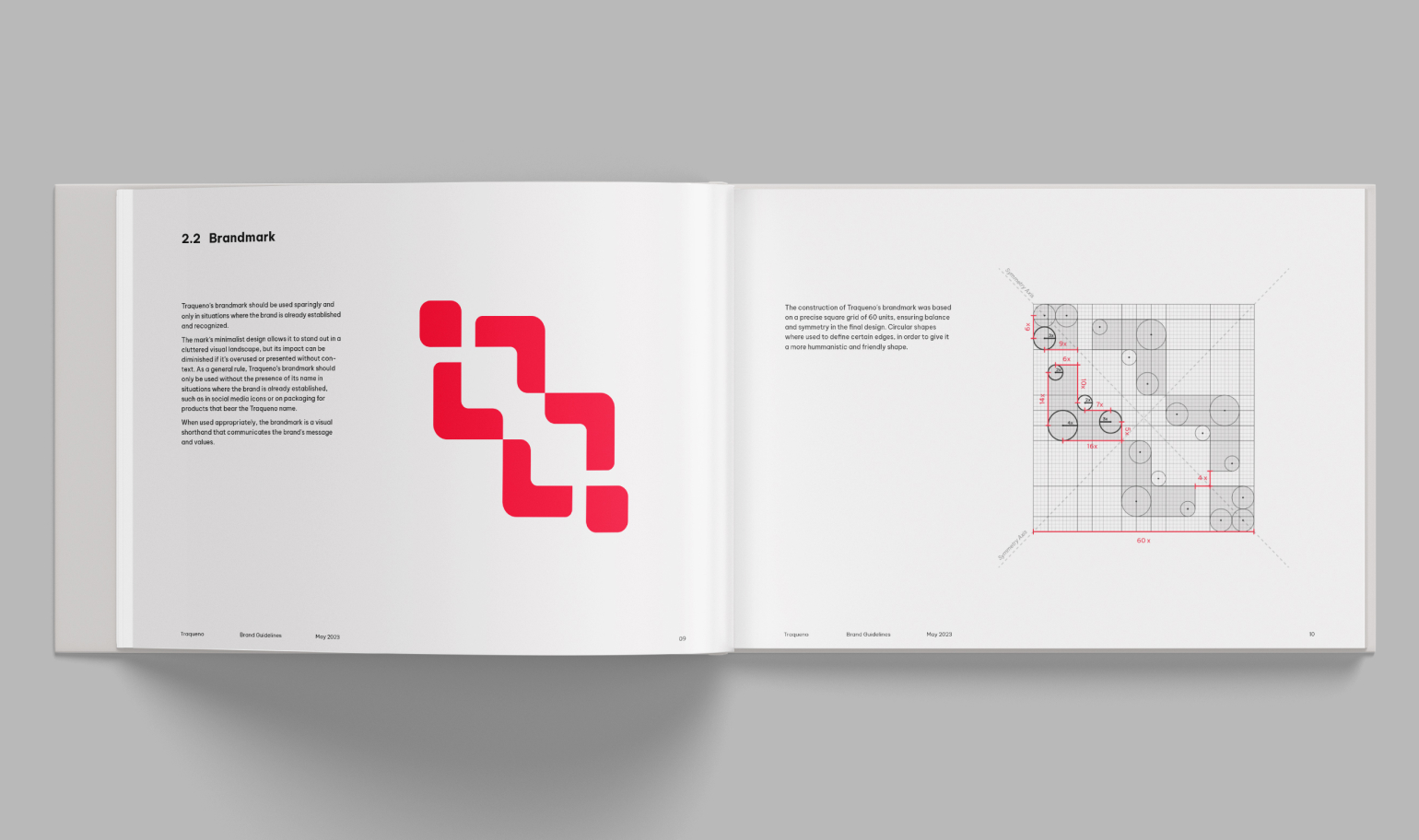
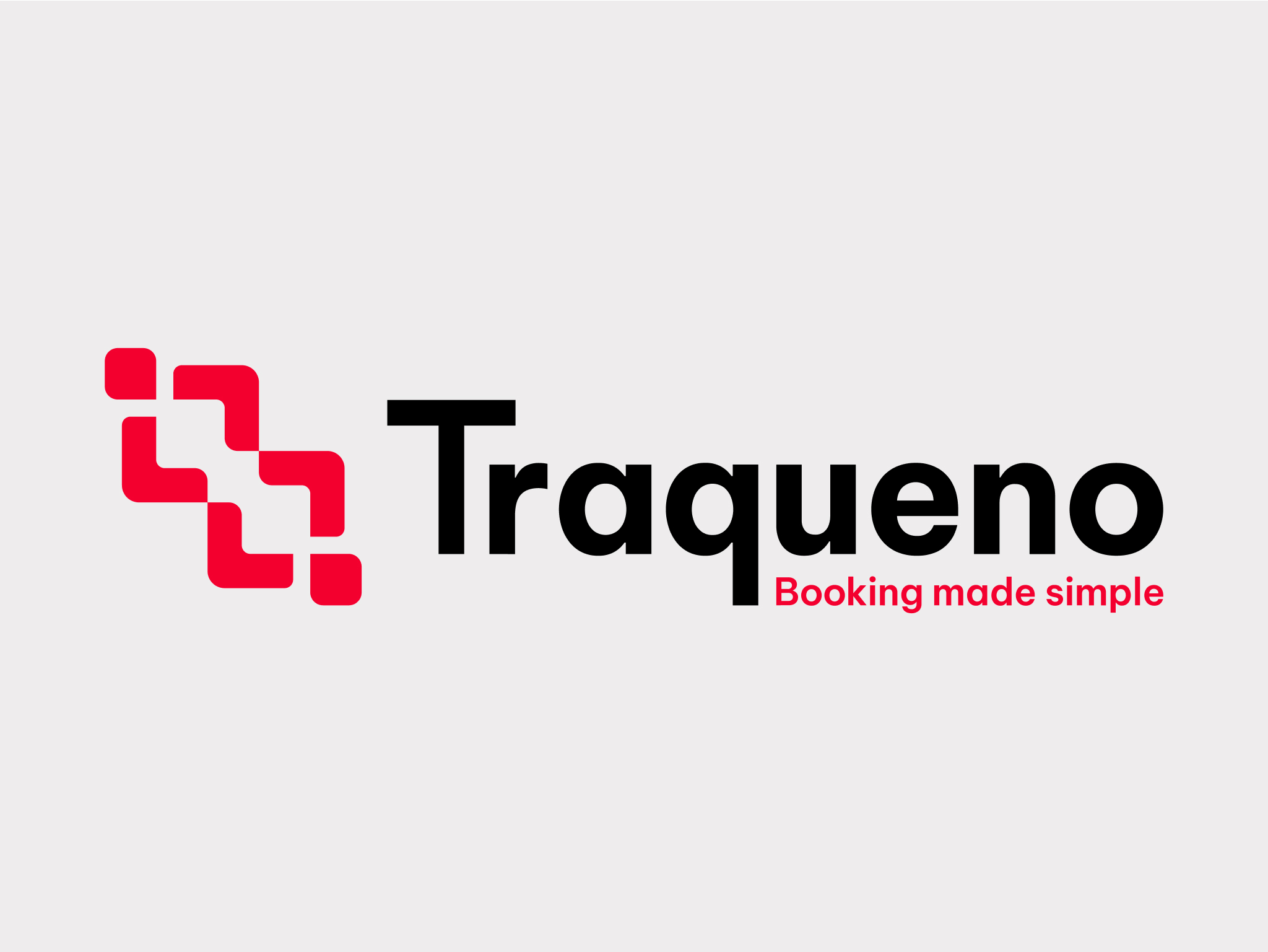
The concept behind Traqueno’s logo comes from the brand’s mission and ambition to connect service providers and clients. This relation is illustrated in a minimalist symbol composed of two shapes coming together, each representing a different group. These two shapes are seamlessly integrated, signifying Traqueno's ability to bridge the gap between service providers and clients.

Two human-like pictograms from Traqueno's logo positioned side by side: the left one is red, and the right one is gray. Each pictogram consists of a diamond-shaped head above two angled lines forming an open-ended diamond-like body. Two human-like pictograms from Traqueno's logo rotated horizontally and connected at the hands. One is red and the other gray. Each pictogram consists of a diamond-shaped head above two angled lines forming an open-ended diamond-like body. Two human-like pictograms from Traqueno's logo rotated in 45º degrees, connected at the hands. One is red and the other gray. Each pictogram consists of a diamond-shaped head above two angled lines forming an open-ended diamond-like body.

Color Palette

The primary color of Traqueno is a vibrant shade of red, conveying warmth and creating a sense of connection with the app users. The color palette also incorporates a light gray, adding a touch of modernity and sophistication to the brand, while black provides a strong contrast.

A red square color swatch showcasing the color #F4002F A gray square color swatch showcasing the color #EEEDED A black square color swatch showcasing the color #000000

Typography

Traqueno communicates through the font family Be Vietnam Pro. This typography was chosen for its modern look and readability, that reflects the company's forward‑thinking mindset. The font's sleek and minimalist design allows for clear and concise messaging, which is important for a brand that emphasizes efficiency and convenience. This family’s large variety of weights allows Traqueno’s identity more versatility and adaptability.

A preview of the Be Vietnam Pro font family, showing different weights.

Brand Manual

A clean, minimalistic cover design for Traqueno's Brand Guidelines book. The cover, dated May 2023, features a white background with bold black text reading 'Brand Guidelines' in a modern sans-serif font. The Traqueno logotype is placed in the bottom right corner. Traqueno's Brand Guidelines book opened. The left page is red with '1. Introduction' printed, and the right page features the word 'Trabalho', meaning work, followed by a plus symbol and the word 'Pequeno', meaning 'small' in a bold font. Part of the word 'Trabalho', 'Tra' and 'Pequeno', 'queno' is in red, while the remaining is in light gray, higlihting the company's name 'Traqueno' origin A double-page spread from the Traqueno brand guidelines, showcasing the brandmark and its construction. On the left page, the brandmark is displayed in red. On the right page, a grid-based illustration reveals the meticulous design process behind the brandmark's construction. The grid lines and circles highlight the careful arrangement of shapes. A double-page spread from the Traqueno brand guidelines, showcasing the logotype in various color and black and white versions. On the left page, titled '3.2 Logo Colored Variants,' two logotype variations are displayed: a black and red primary version over white and a white secondary version over red. On the right page, titled '3.2 Logo Black and White,' two logotype variations are shown: a black logotype on a white background and a white logotype on a black background. Each logo features the Traqueno wordmark and the brandmark.

Identity Applications

A red stock of business cards on top of each other with rounded corners. The top card reads 'Guilherme Vila Maior, Lead UI Designer' with contact information below. A commercial poster for Traqueno's application showcasing two phone mockups. It reads 'Traqueno aims to be the bridge between customers and service providers'. It includes a QR code to the app. A phone mockup showcasing three Traqueno's instagram posts promoting the application. A grey notebook mockup with Traqueno's logotype printed on the cover and a red strap.